climate and environment
This map shows the risk level from air pollution in each neighborhood in comparison to the rest of Central Indiana. Risk is based on the toxicity and amount of emissions and the number of people nearby.
Temperature
Average temperature since 1948
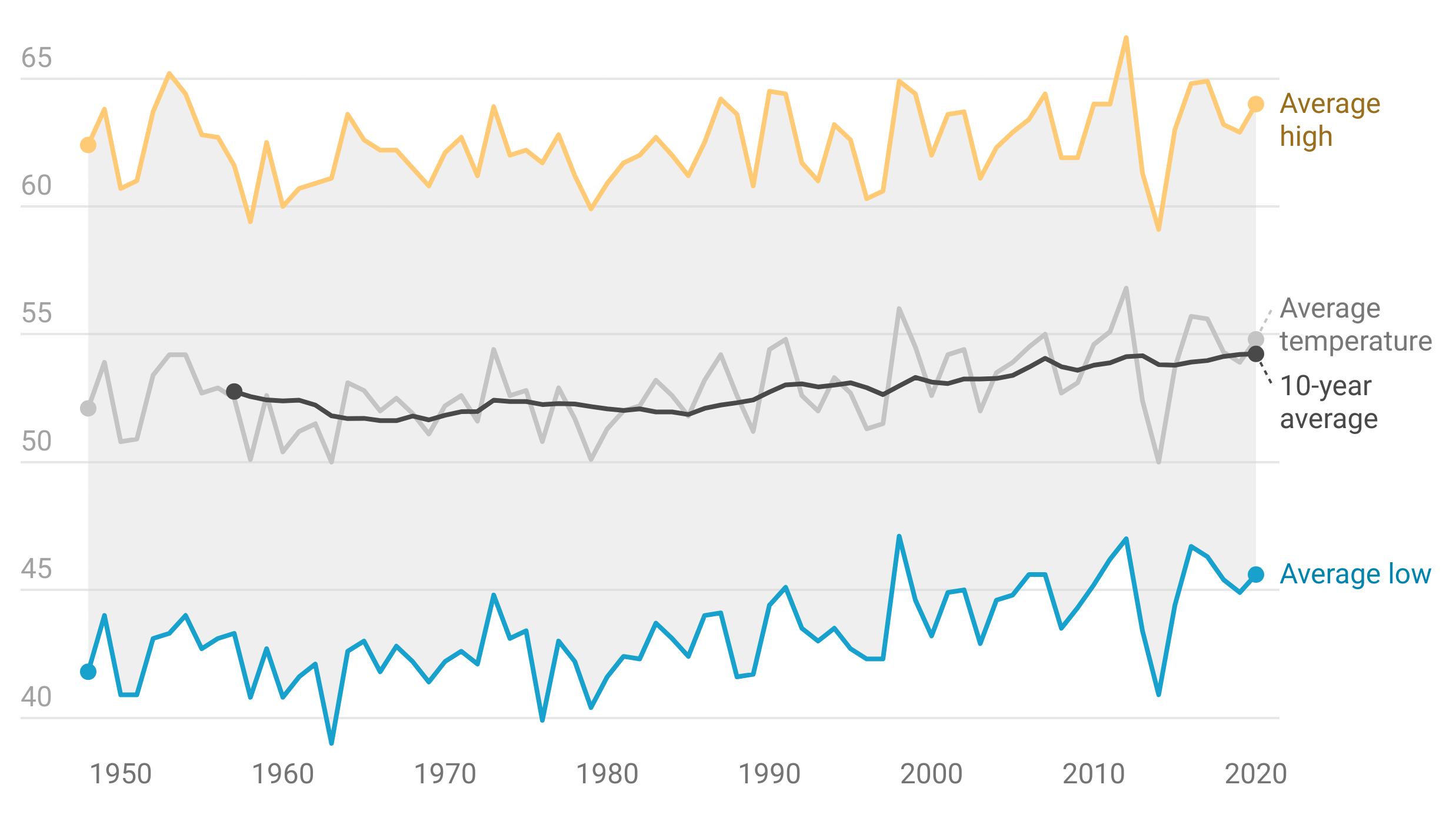

63°
Average high temperature

44°
Average low temperature
- April 17 Average last frost date
- October 16 Average first frost date
- 182 days Growing season
Temperature records
- 106° Hottest day on record (Tuesday, July 14, 1936)
- -27° Coldest day on record (Wednesday, January 19, 1994)
- 55.4° average Hottest year on record (1921)
- 48.3° average Coldest year on record (1917)
- May 27, 1961 Latest freeze
- September 30, 1899 Earliest freeze
Precipitation
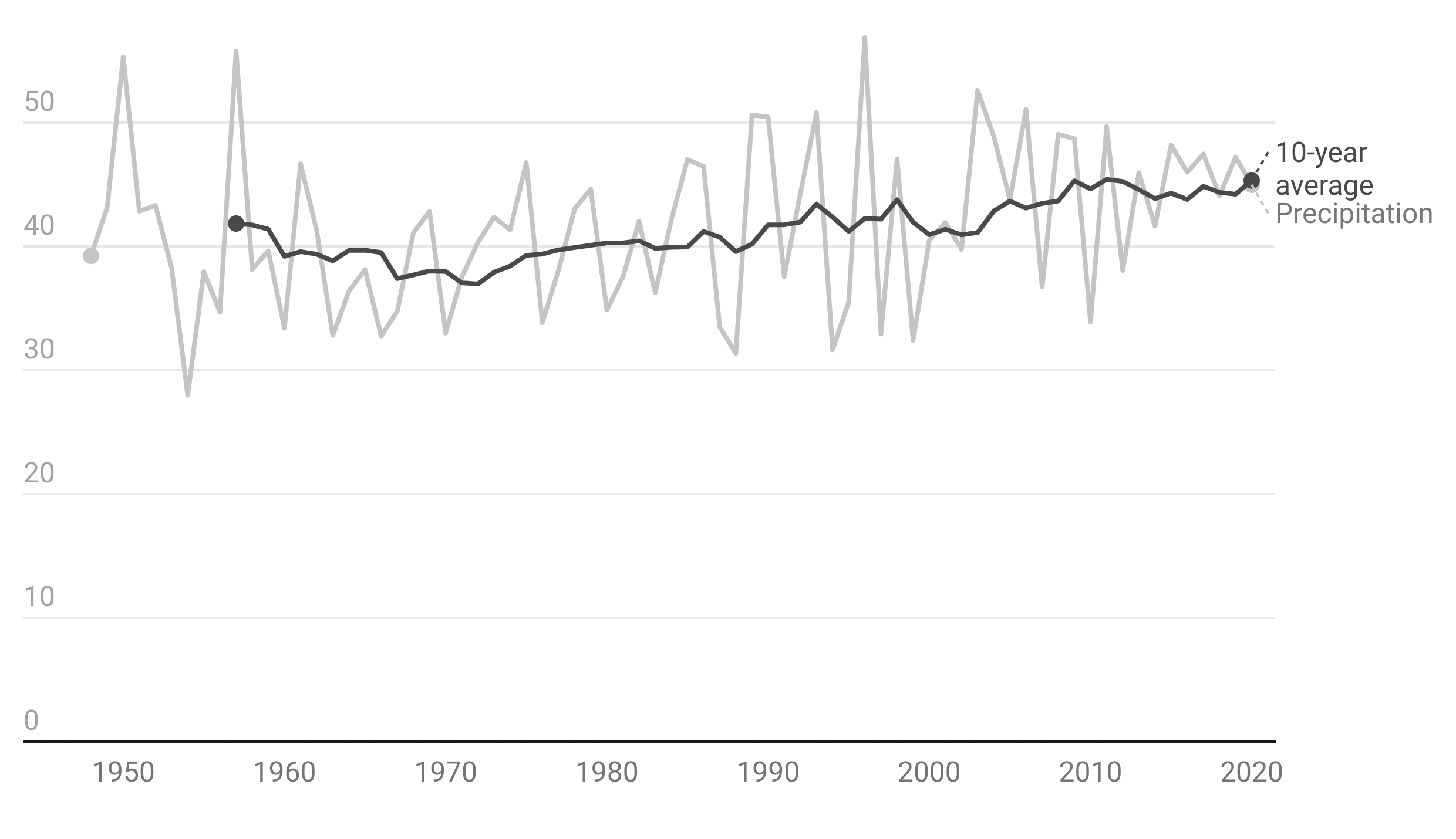
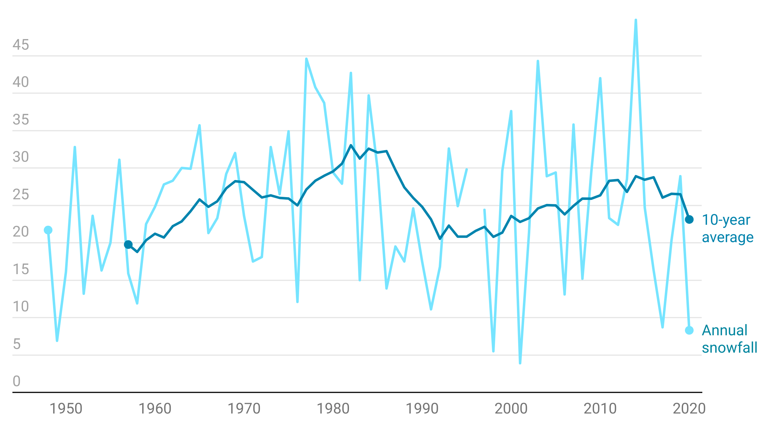
Annual Averages
42.4 inches Average annual precipitation

25.9 inches Average annual snowfall
- 13 Extreme precipitation events per year (two inches or greater)
- 6 Heavy snow events per year (two inches or greater)
- 39 percent of precipitation is snow
Precipitation Records
- 12.5 inches Maximum snowfall in 24 hours (Feb. 24-25, 1965)
- 13 days Most consecutive rainy days (Apr. 9-21, 1893)
- 39 days Most consecutive days without rain (Aug. 14-Sep. 22, 1908)
- 7.2 inches Most precipitation in one day (Sep. 1, 2003)
- July, 2015 Wettest month (13.1 inches of rain)
- March, 1910 Driest month (0.07 inches of rain)
- 1876 Wettest year (57.5 inches of rain)
- 1934 Driest year (24.97 inches of rain)
Environment
Particle pollution can cause lung damage, asthma, and early death. These particles are created from point-source pollution, like power plants and factories, and from non-point-sources, such as agricultural dust and vehicle exhaust.
Indianapolis’ particle pollution has improved over the decades. Improved fuel efficiency and emissions for vehicles have helped, as well as conversion away from coal power plants. The recommended annual average for particle pollution is below 12 micrograms per cubic meter.
Particulate Matter in Midwestern Cities
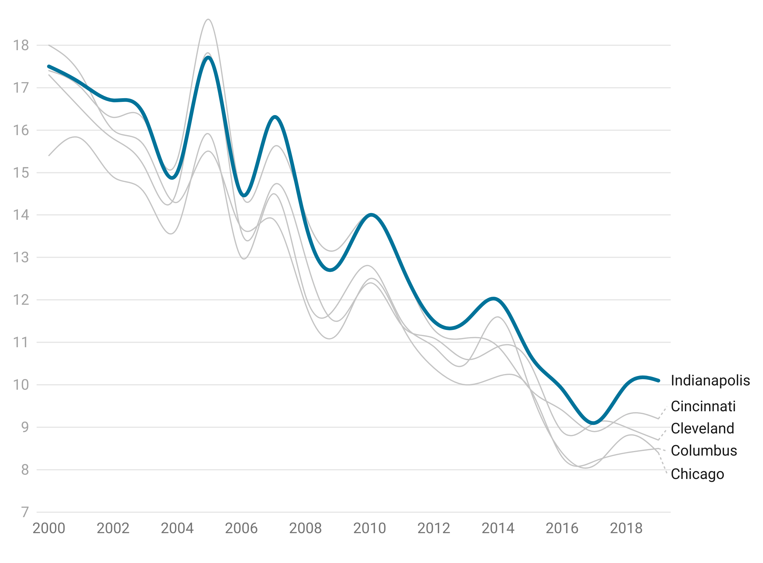
Micrograms per cubic meter of PM2.5 (particle 2.5 micrometers or smaller) in metro areas
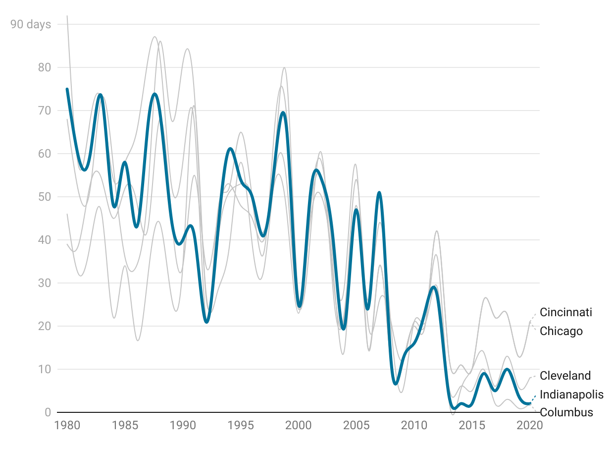
Ozone is smog. It is created when pollution from vehicles, power plants, and industrial facilities react with heat and sunlight. Ozone is more common on hot summer days.
Ozone levels of 0.08 parts per million can cause a wide range of respiratory effects, and 0.072 parts per million can cause “decreased lung function and increased respiratory symptoms,” according to the Environmental Protection Agency.
Ozone levels have declined in the past decades but have been rising slowly since 2013. This is similar to other midwestern peers.
Water Quality in Streams, Lakes, and Aquifers
There are dozens of substances that can affect water quality:
Bacteria such as E. coli is a key indicator of the presence of harmful bacteria and can cause illness. Treated drinking water should have no E. coli, while water for swimming should have less than 232 colony forming units (CFUs) per 100ml.
Phosphorus is naturally occurring in bodies of water, but too much can cause excess algae growth, which reduces oxygen levels in the water and harms fish. Excess phosphorus enters streams and lakes when fertilizer is carried by stormwater runoff.
Polychlorinated biphenyls (PCBs) are manmade chemicals used in consumer products until they were banned in 1979. These chemicals are still present in streams and can be ingested by fish.
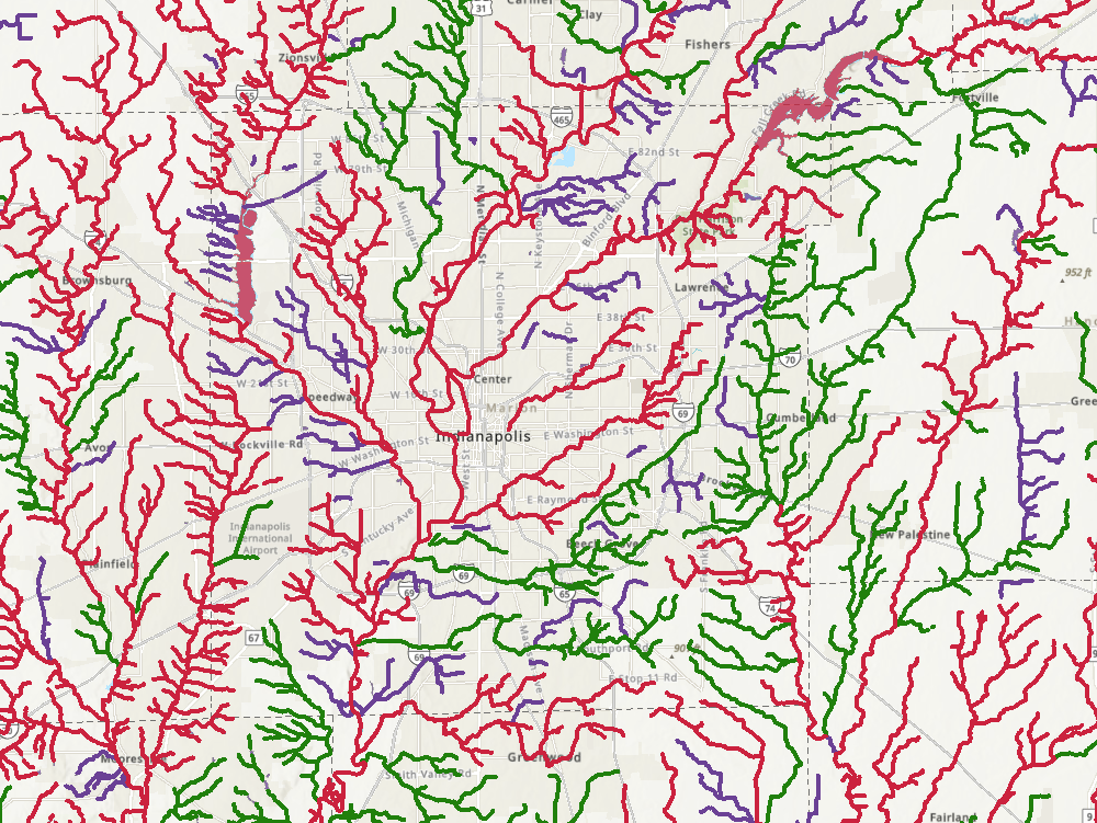
The map shows the polluted (red), good (green), and unassessed (purple) waterways in Central Indiana. To explore the physical, chemical, and biological factors affecting Indiana’s water quality, explore the How’s My Waterway map from EPA.
Drinking Water Quality
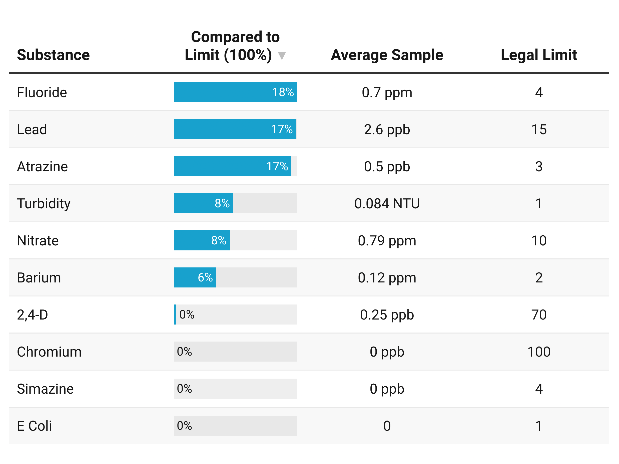
This information is for Citizens Energy Group’s Indianapolis and Morgan County water service, which includes the blue service are shown on this map.
After treatment, drinking water had no substances that exceeded the legal limit. Substances with the highest relative amounts (compared to the limit) were fluoride, lead, and atrazine. Fluoride is added during treatment. At appropriate levels, it can prevent dental disease. Atrazine is a preemergent weed killer used frequently on lawns and corn. Lead comes from the disintegration of pipes. While the EPA sets the legal limit at 15 parts per billion, any amount over zero poses some risk.
Mosquito Counts
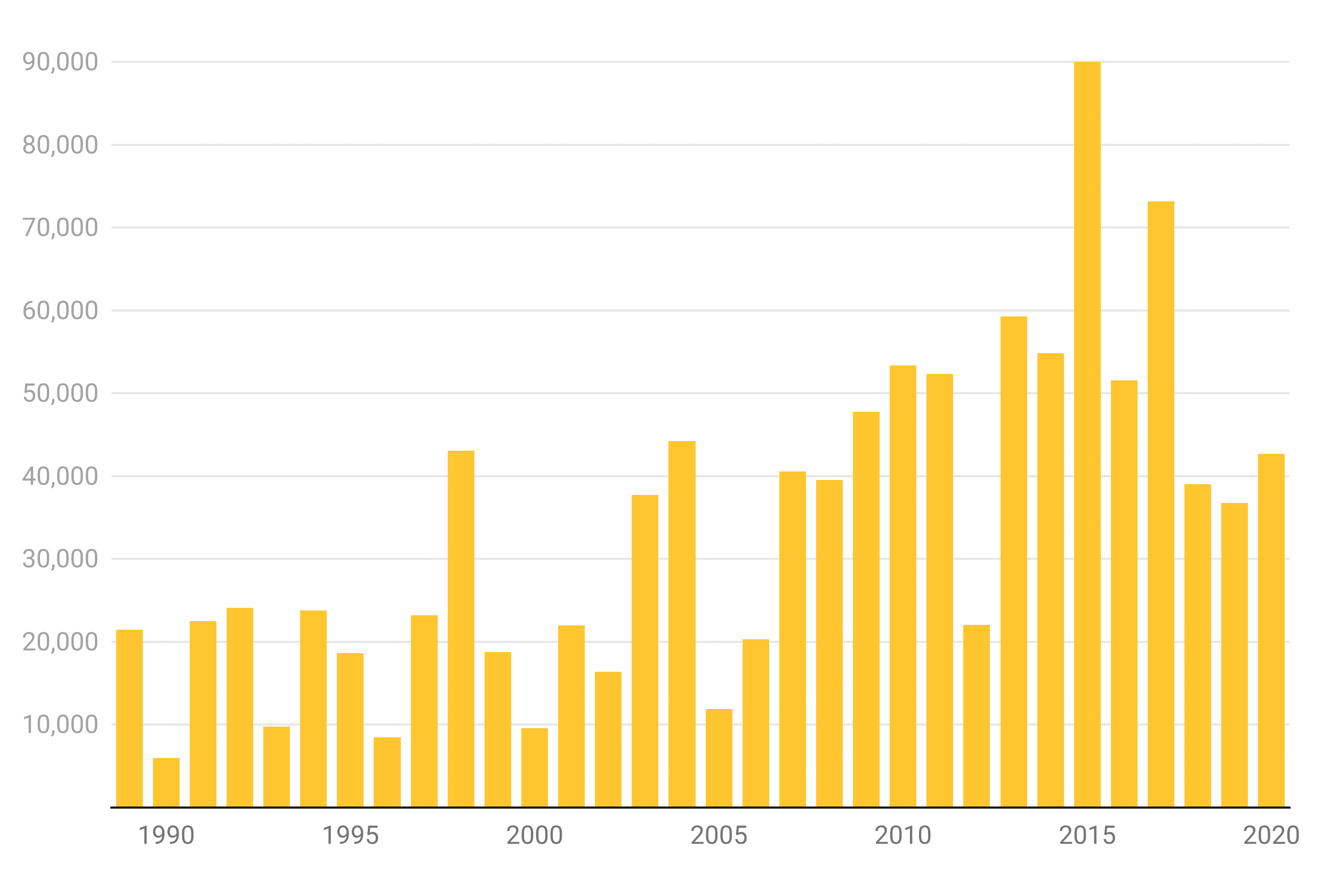
Mosquitos thrive in heat and moisture and can carry West Nile Virus and other diseases. Marion County Health Department traps mosquitos at locations throughout the city to count and study them. This chart represents the number of mosquitos caught in their traps each year. Counts have been increasing since the mid-2000s.
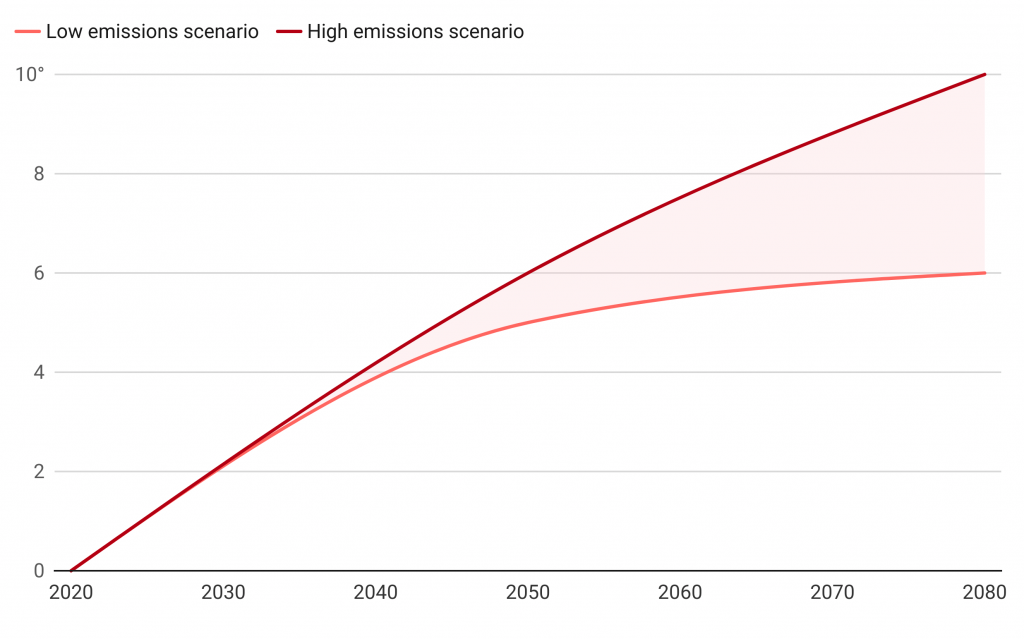
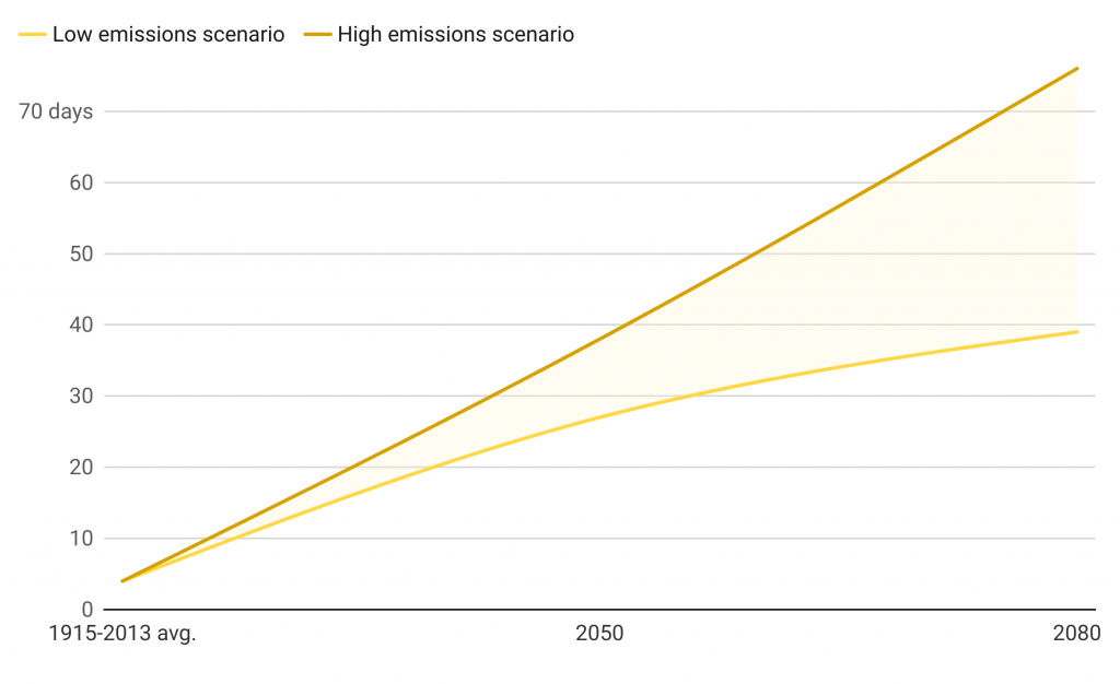
Climate Change
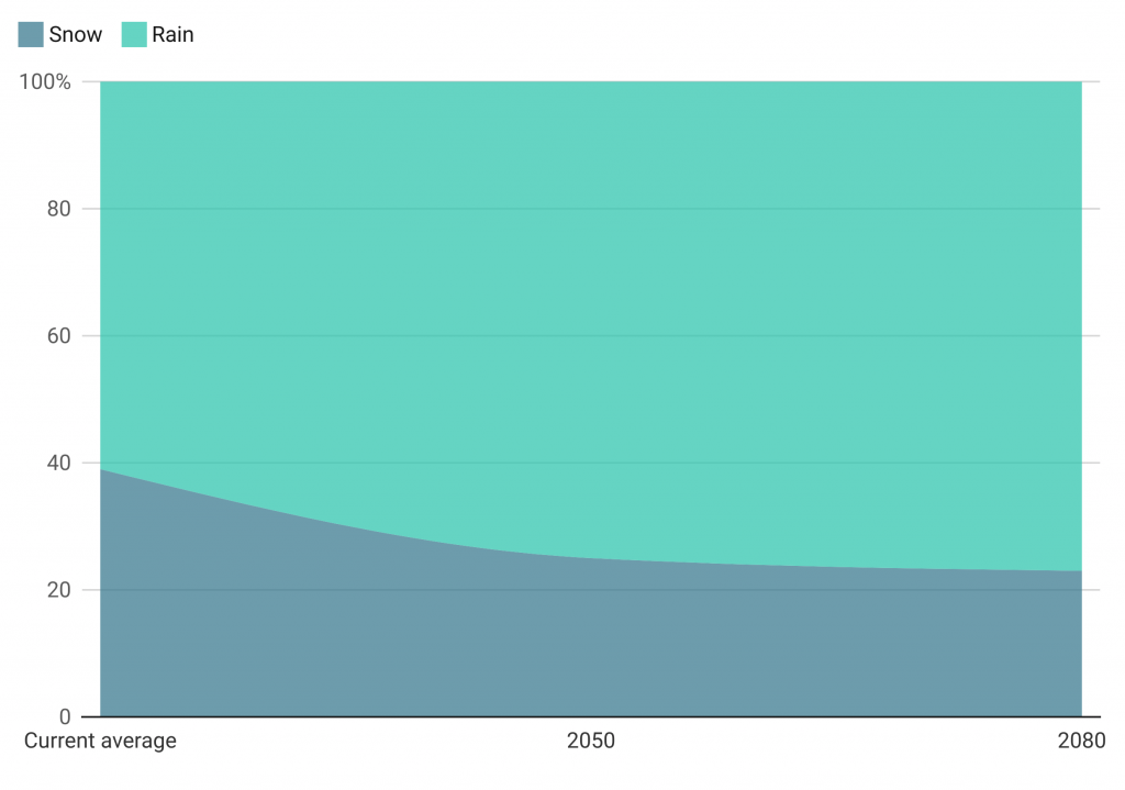
By 2050 Indianapolis will receive an estimated 2.5-3.4 more inches of rain per year. There will be an average of four more extreme rain events (more than 2 inches) per year. Heavy snow days (more than 2 inches) will fall from an average of 6 now to 3 heavy snow days in 2050 and 2 heavy snow days in 2080.
Estimated increase in average temperature
Share of precipitation that falls as snow or rain
Number of days with high reaching over 95°
Atlas Sources
Air pollution risk level is from SAVI Community Information using data from U.S. Environmental Protection Agency’s Risk Screening Environmental Index. Current climate data is from the National Weather Service. Environmental data is from U.S. Environmental Protection Agency. Climate change estimates are from Purdue University (Indiana Climate Report) and the Indiana University Environmental Resiliency Institute (Hoosier Resiliency Index).
Additional Information
Read these Encyclopedia of Indianapolis Entries for more information.