Economy
This map shows private sector jobs in each census tract. Larger bubbles represent more jobs. Bubbles are colored by the predominant sector.
People Who Power the Economy
How an aging population impacts the workforce
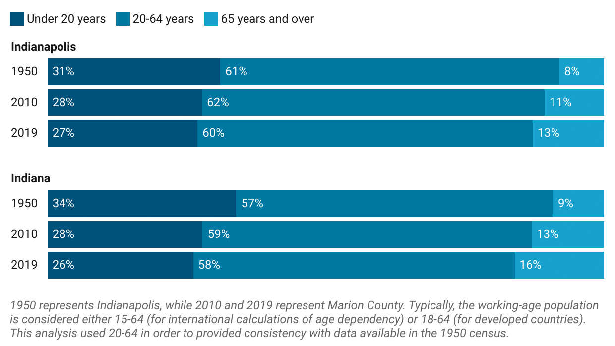
A balanced economy has enough workers to support those who are not working. The dependency ratio measures this balance. Workers provide direct support to dependents, like food, housing, and education for children, and indirect support, like the cost of the medical system or taxes to support social programs directed at youth or older adults.
Indianapolis’ age dependency ratio is increasing slightly as the older population grows. The younger share of the population is shrinking, which compensates for the increased share of dependents but will eventually lead to a smaller share of working-age people. Indianapolis continues to have a lower dependency ratio than Indiana overall, because the city has a smaller share of both young people and older adults.
How education drives income
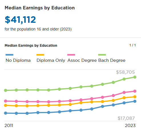
Median earnings are higher for people with a bachelor’s degree than for people without, even when compared to those who have an associate’s degree or have attended some college. Most adults nationally and locally do not have a bachelor’s degree.
How people earn money
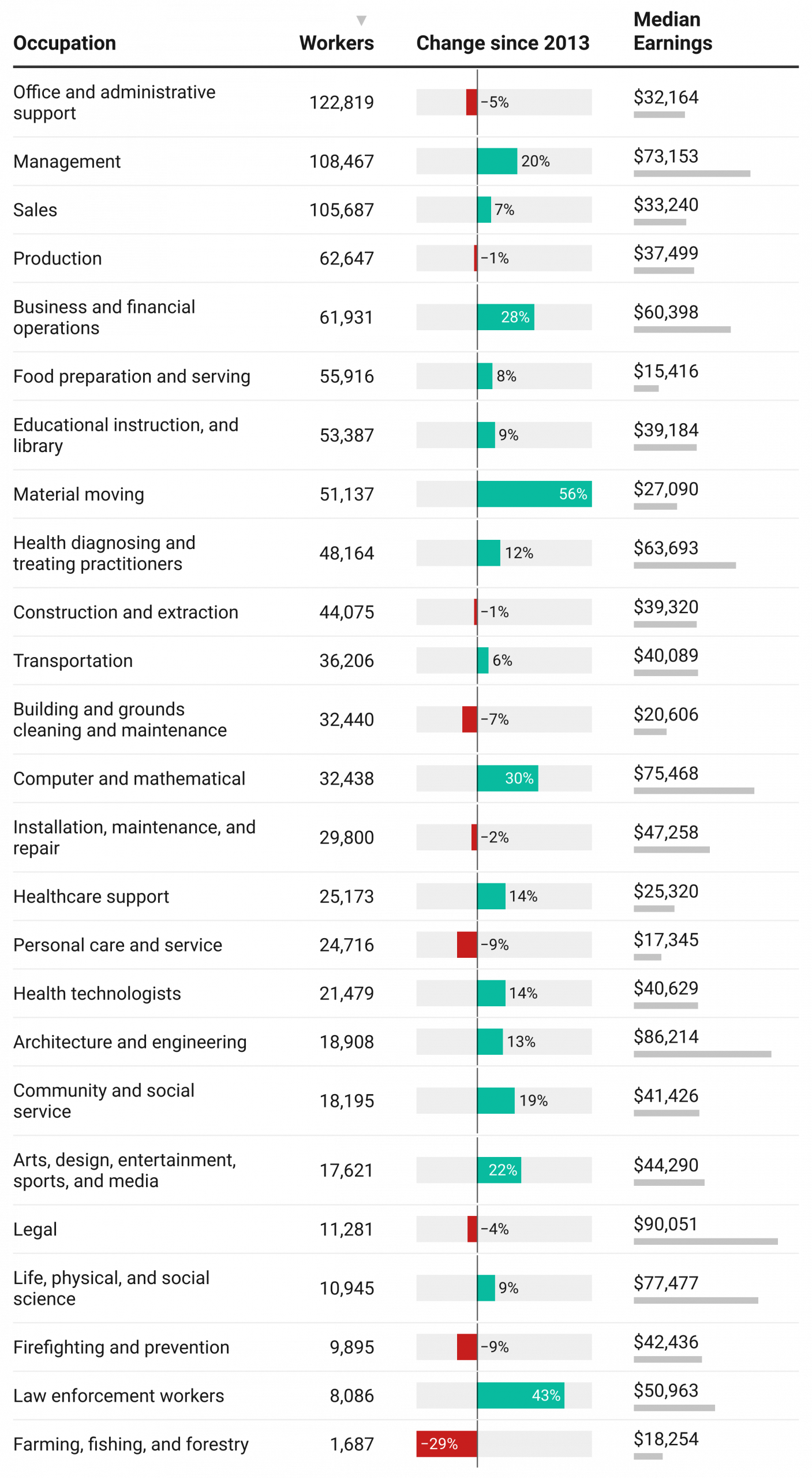
This is a selection of some of the major occupations in Central Indiana. The table below shows every occupational group along with the number of employees and the median earnings.
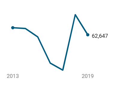
Production
62,647 workers | $37,499 median earnings
Line workers, machinists, makers, operators, food processors
Trend
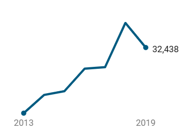
Computers & Mathematics
32,438 workers | $75,468 median earnings
Analysts, developers, network administrators
Trend
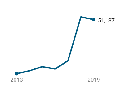
Material moving
51,137 workers | $27,090 median earnings
Warehouse workers, packers, stockers, forklift operators, crane operators
Trend
Are incomes growing?
Per capita personal income over time

Income growth has been faster in some counties than in others. After adjusting for inflation, per capita personal income in Hamilton County has grown by $47,187 since 1969, and Boone County income grew fastest ($49,291). In Marion County per capita income has grown by $25,105. Johnson County grew more slowly ($23,400), but both are faster than the state’s per capita income growth of $22,897.
Since 2000, real income has grown by $6,518 in Marion, $9,376 in Hamilton County, and $19,286 in Boone County. Most counties experienced flat or declining income during the 2000s and income growth as the end of the Great Recession brought about a decade of economic improvement.
Is income equitable across gender and race?
Median annual earnings by race, ethnicity, and gender in Marion County

White men who work full-time earn more than women or non-white men who also work full-time. Systemic inequities have excluded women and people of color from the education, opportunities, and networks that lead to high-paying occupations. Neither differing employment rates nor working hours per week account for the differences in pay.
Is equity in pay improving over time?
The income gap has increase for Black men compared to white men over the last two decades. For Latino men, the gap is about the same as it was in 2000. The equity gap has closed slightly for white women and Latino women compared to white men, but it remains substantially unchanged. For Asian women, the equity gap with white men has increased significantly since 2010.
Equity in men’s median earnings by race
Earnings for men of each race and ethnicity for every $100 of earnings for white men (full-time, year-round workers)

Equity in women’s median earnings by race
Earnings for women of each race and ethnicity for every $100 of earnings for white men (full-time, year-round workers)

Industries that Drive the Economy
Most firms in Central Indiana have fewer than 20 employees, but firms with 100 employees or more employ most of Central Indiana’s workers. On average, large firms pay more than smaller firms.
38,977 firms | 194,000 estimated employees
Indiana’s average annual pay at firms with 0-19 employees is $38,000.
Estimated employees based on the average number of employees per small business in Indiana.
Trend
Businesses with 0-19 employees.
6,962 firms | 268,000 estimated employees
Indiana’s average annual pay at firms with 20-99 employees is $39,000.
Estimated employees based on the average number of employees per medium business in Indiana.
Trend
Businesses with 20-99 employees.
1,529 firms | 448,000 estimated employees
Indiana’s average annual pay at firms with 100 or more employees is $51,000.
Estimated employees based on the average number of employees per large business in Indiana.
Trend
Businesses with 100 or more employees.

Dominant Sectors over Time
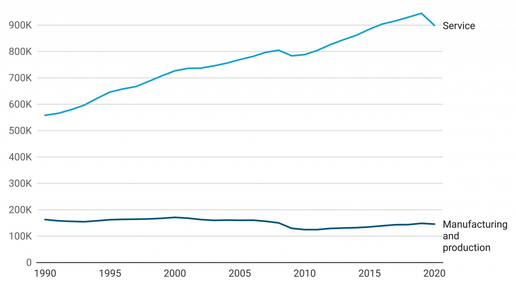
Manufacturing and production jobs shrunk by 10 percent between 1990 and 2020, while the service sector grew by 61 percent.
During this period, the service sector added 229,000 jobs and the goods-producing sector lost 38,200 jobs (mostly during the Great Recession). Since 2010, the service sector has added 110,800 jobs, while the goods-producing sector added only 21,100.
Manufacturing made up 23 percent of the economy in 1990, but by 2020 it had fallen to 14 percent of the economy. This shift resulted from outsourcing of manufacturing jobs to overseas suppliers. Although manufacturing lost 37,800 jobs since 1990, the losses were not spread evenly across all manufacturers. For example, jobs in manufacturing vehicle parts declined by 18,200, but jobs in chemical manufacturing rose by 6,000.
Most service jobs cannot be shifted abroad, so it has been the strongest jobs-creating sector. The service sector includes a mix of high-skill, high-wage jobs, such as doctors and technology professionals, and and low-wage jobs, such as home health aides or waste management. Transportation and warehousing have added 46,500 jobs since 1990, a growth rate of 65 percent.
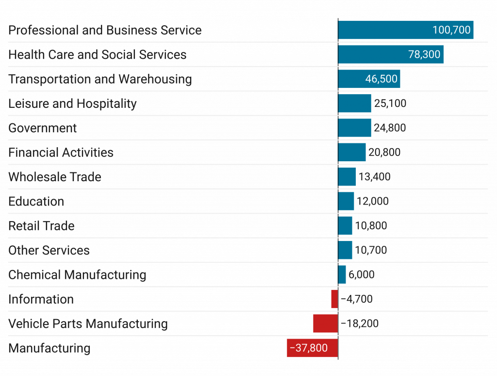
Dominant sectors in our economy in the last 30 years have been service sectors like health care and professional services. These sectors have a mix of high-skill, high-wage jobs (like doctors and IT professionals) and low-wage jobs (like home health aides or waste management). Transportation and warehousing has added 46,500 jobs since 1990. This represents growth of 65 percent.
The manufacturing sector lost 37,800 jobs since 1990, but the losses were not spread evenly across all manufacturers. For example, while jobs in manufacturing vehicle parts declined by 18,200, jobs in chemical manufacturing rose by 6,000. Despite declines, manufacturing is still a strong sector. One-in-twelve workers in Central Indiana is employed in manufacturing.


Trade
Domestic Imports and Exports
$112.3 billion Central Indiana’s total exports to U.S. cities and states (2018)
$118.6 billion Central Indiana’s total imports from U.S. cities and states (2018)
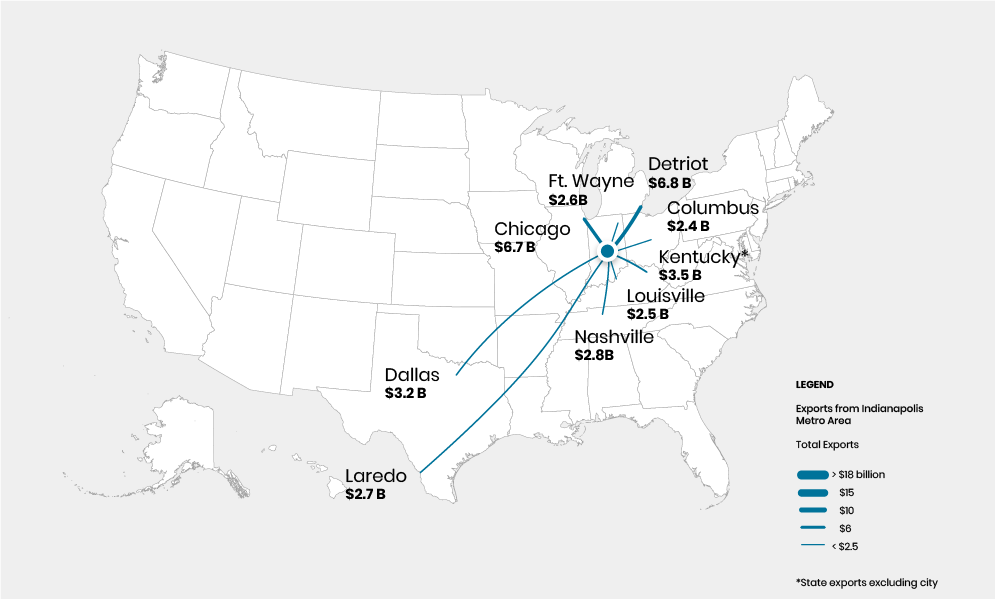
Domestic Exports
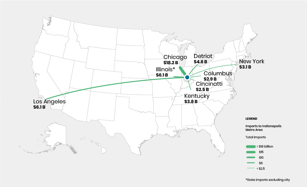
Domestic Imports
In these statistics, Central Indiana is defined as the 2012 Indianapolis-Carmel-Muncie Combined Statistical Area, which includes Bartholomew and Delaware counties.
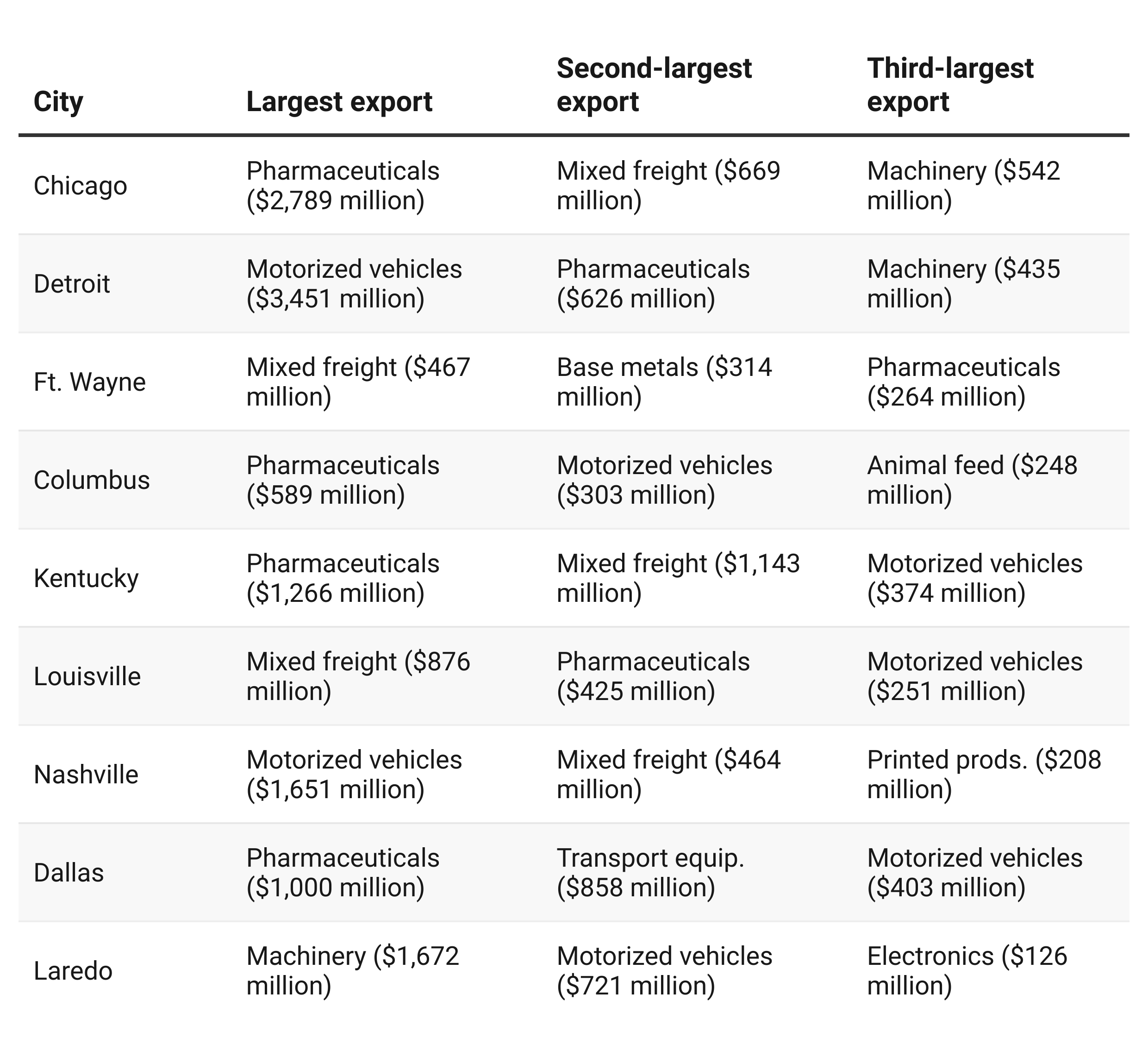
Largest exports to U.S. regions
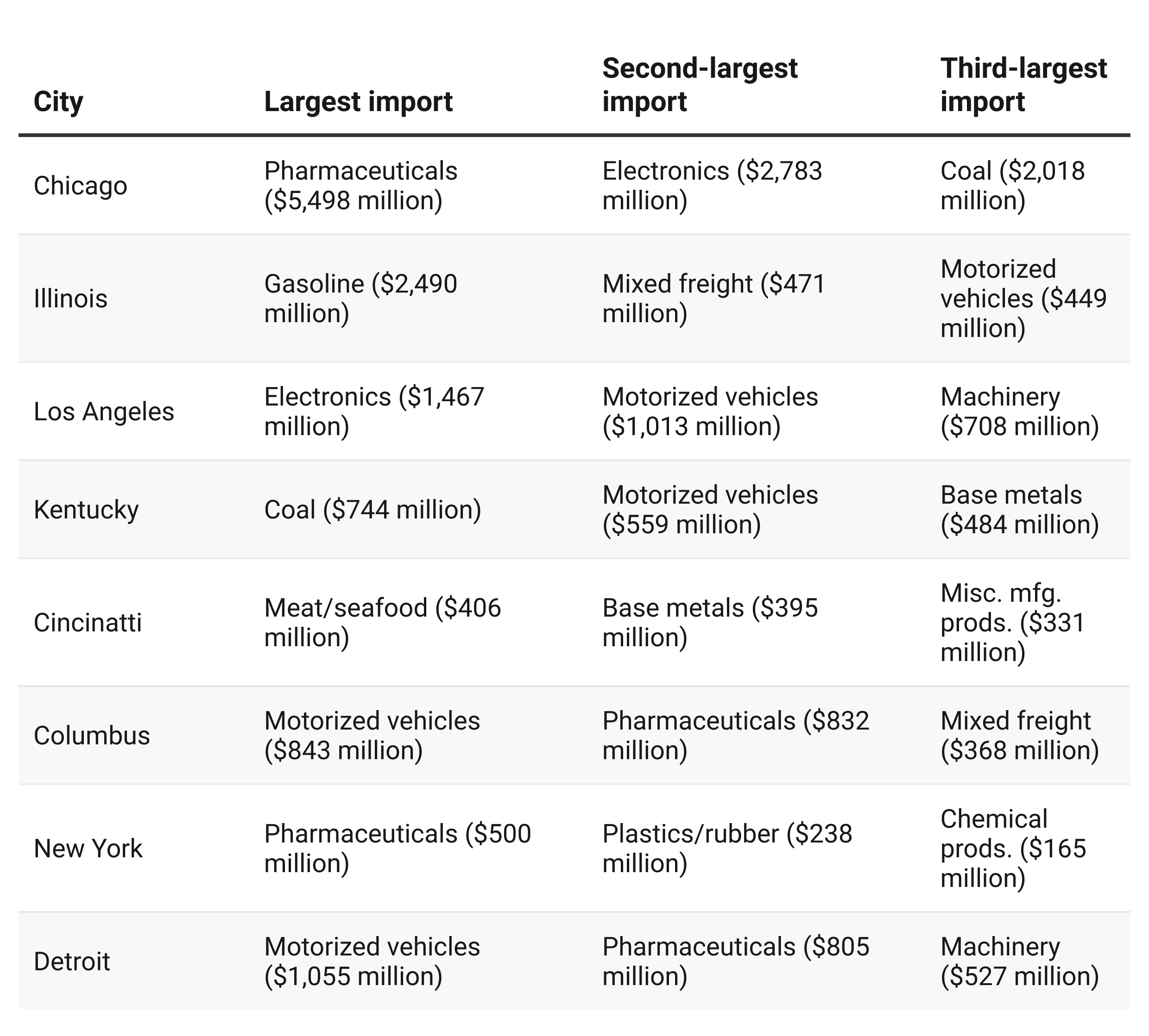
Largest imports from U.S. regions
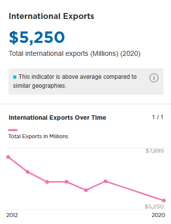
International Exports
$11.1 billion Central Indiana’s international exports (2019)
In these statistics, Central Indiana is defined as the 2013 Indianapolis Metropolitan Statistical Area.
Total International Exports over Time
Top International Export Products
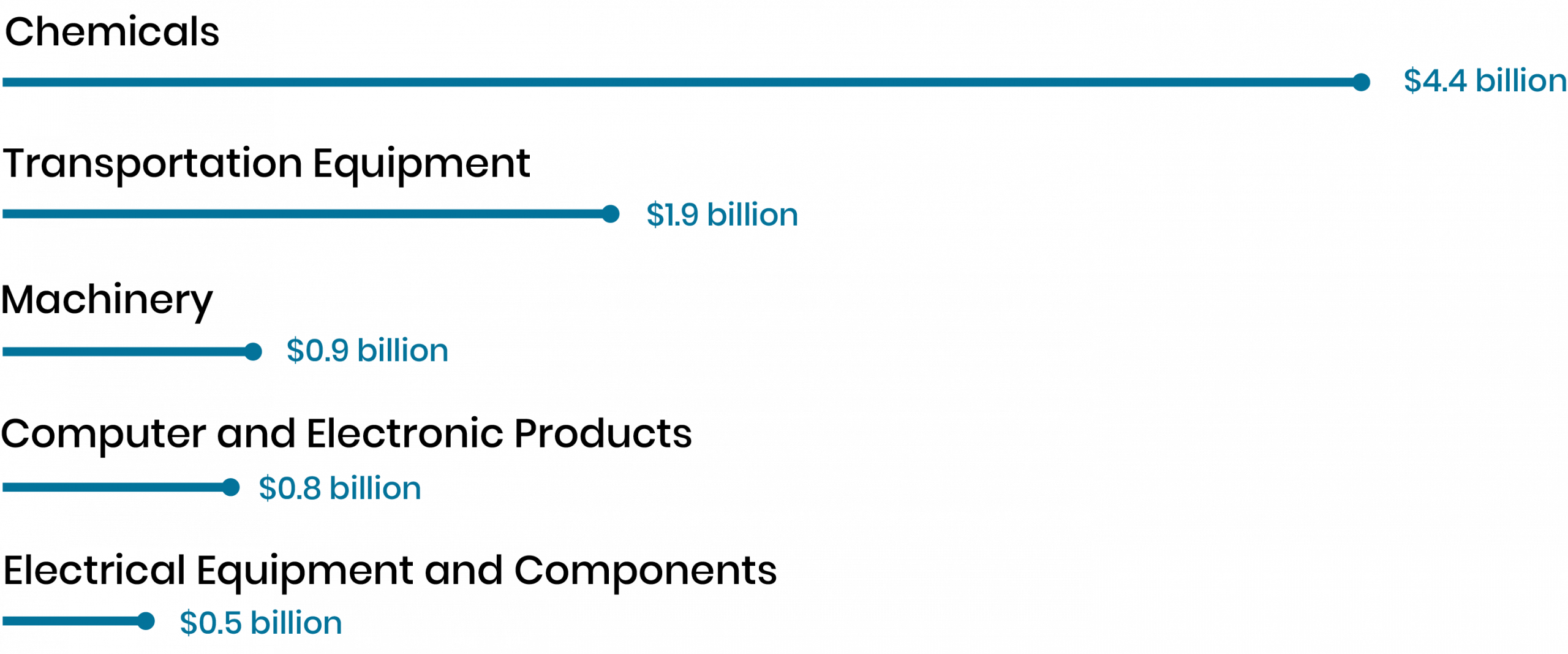
Chemicals make up the largest portion of Indianapolis’ international exports. This includes pharmaceutical products. Transportation equipment includes vehicles and vehicle parts.
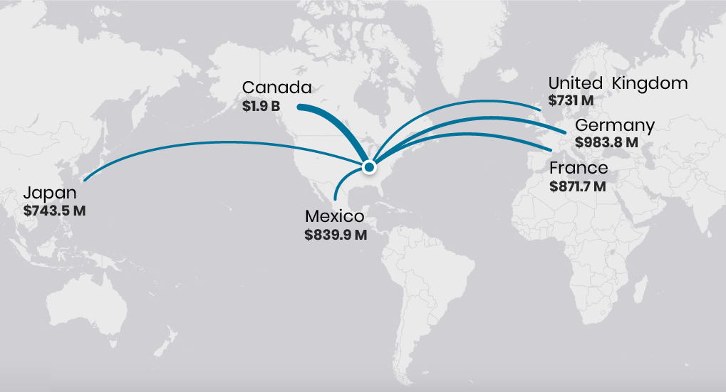
Top International Export Locations
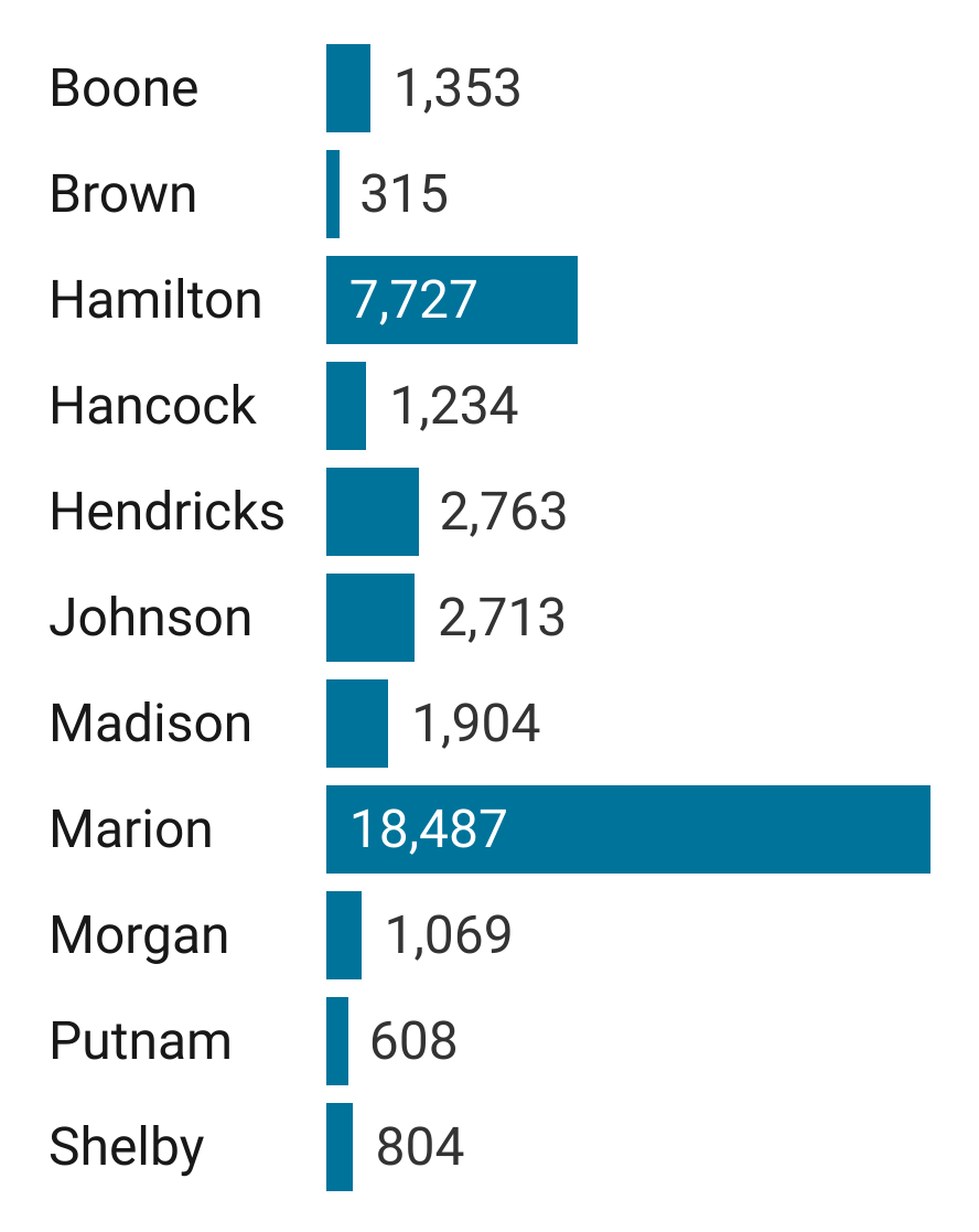
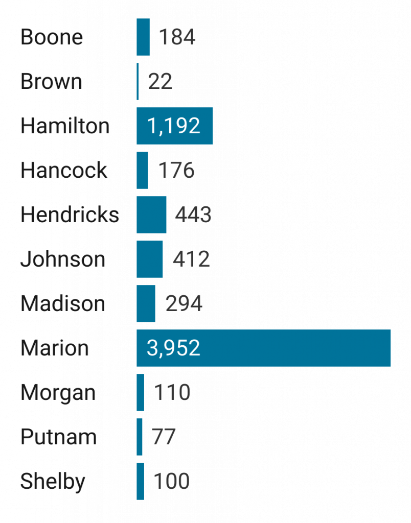
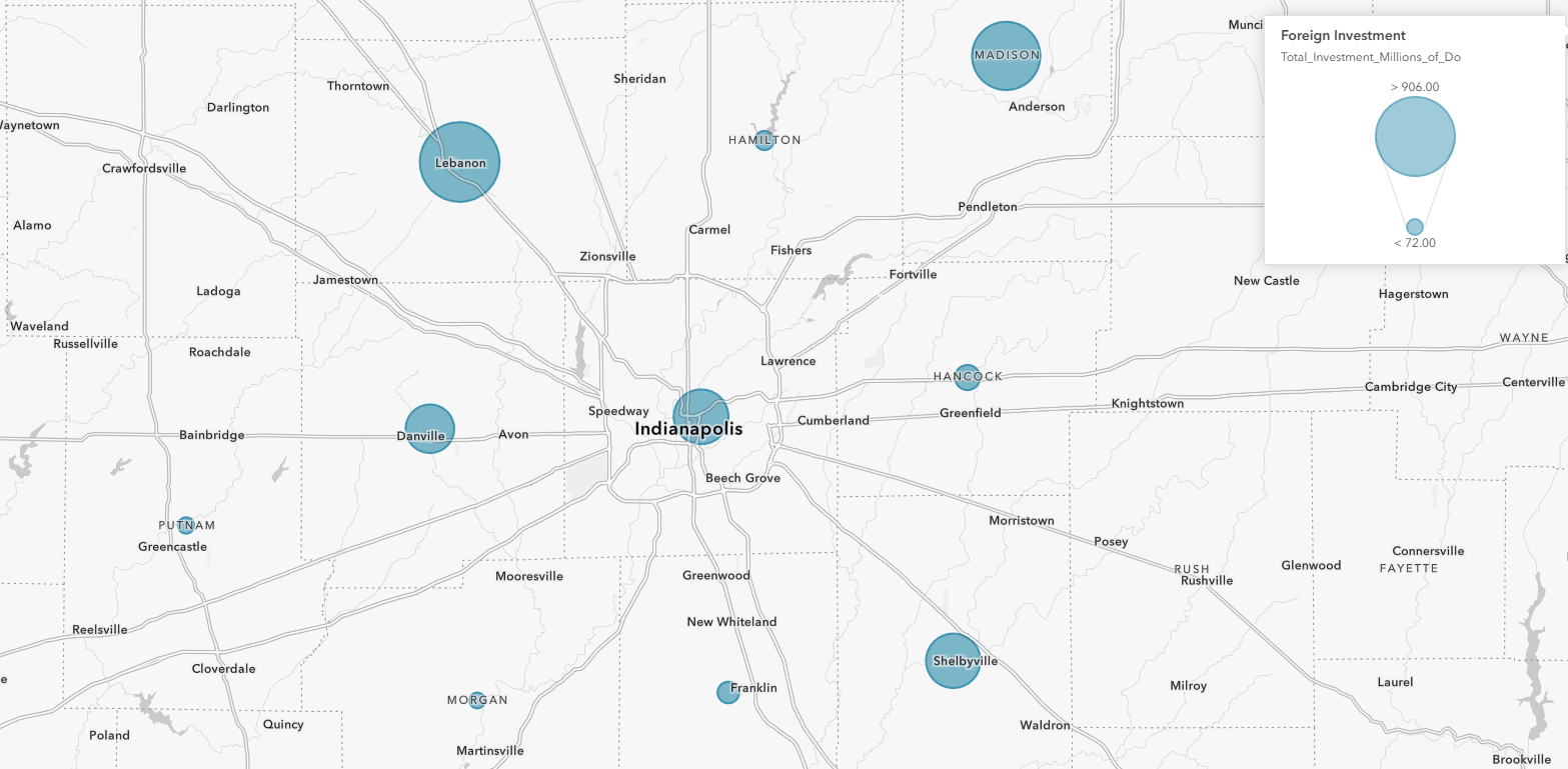
Foreign Direct Investment
International trading partners contribute the the Central Indiana economy through direct capital investments like new warehouses or expanded production plants. This map shows the total direct investment from foreign countries in each county between 2013 and 2020.
View the full map to see the source of investments for each county.
Atlas Sources
People. Jobs by location and sector are from Longitudinal Employer-Household Dynamics Origin-Destination Employment Statistics. Demographic data about age of the population and earnings by education level are from the U.S. Census and the American Community Survey. Occupation data and earnings by race and gender are from the American Community Survey. Per capita personal income is from the Bureau of Economic Analysis.
Industries. Firm size, employees, and wages are from County Business Patterns. Employment by sector over time are from U.S. Bureau of Labor Statistics Quarterly Census of Employment and Wages. Domestic imports and exports are from Freight Analysis Framework from the Bureau of Transportation Statistics. International trade data are from the International Trade Administration. Foreign direct investments were provided by Indiana Business Research Center.
Additional Information
Read these Encyclopedia of Indianapolis Entries for more information.